Article: Inspiration behind the rebrand
Inspiration behind the rebrand
I was sitting in the airport, waiting to board my flight to Italy, when I felt an overwhelming urge to rebrand and start fresh for EP Art. That seed, planted in the back of my mind, and a brand-new Pinterest board, became the perfect beginning to an inspiring trip with friends. Over the next few months, my head was on a swivel and my sketchbook filled with what could be. Classic, funky, bold... the possibilities felt endless. I couldn’t have done it without Sarah’s guidance and craftsmanship. Here are some of the images I gathered from my camera roll and promptly blew up her phone with. She somehow made sense of my scattered inspiration, which is truly a gift.

The perfect green tanks turned into planters- Monaco 2022

A vintage ribbon I bought in Lucca, Italy in August. The colors and birds felt perfect.

Worked on this daffodil fresh cut last spring which was the inspiration for one of the new logos. And the chocolate background was the perfect color inspo!

The spartina grass from home is another perfect green.

Plenty of coral walls in Europe to draw inspiration from... choosing the perfect shade, that's the hard part.

An image from Paris last January.

I painted this for the house I moved into this July. The daffodil shapes and color combo stuck with me.

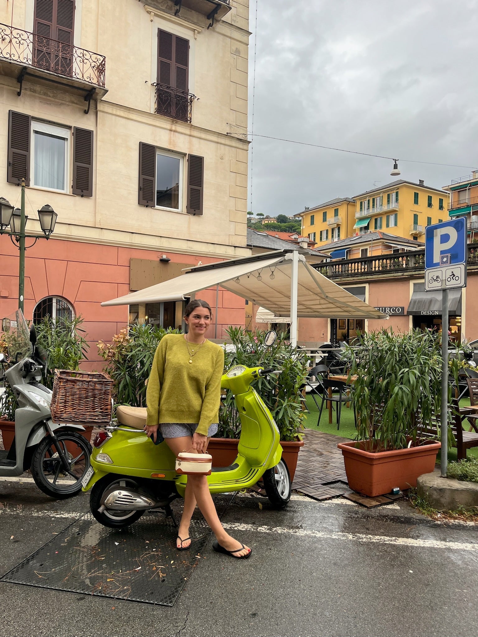
All my favorite things. Coral walls, brown shutters, and a lime green vespa.

I painted these last Summer and the punchy colors felt right for the website too.

Had to share this again, I think about this combination of colors often!


Here is where we landed!! Had to keep the iconic EP, but giving her new life and a color palette that felt very me. The daffodil and quail icons make me so happy.


Sarah. O'neal. Lisk!! 100/10!!!!!
XO, EP